Brochures remain one of the most effective tools in your marketing arsenal, even in a digital-first world. A well-designed brochure gives potential customers something tangible to hold, reference, and pass along, and that physical presence still carries weight that a scrollable webpage often can’t match. Whether you’re promoting a business, an event, or a cause, the right brochure design grabs attention fast, communicates the essentials, and moves your reader toward action.
If you’ve ever stared at a blank template wondering what to put on a brochure, you’re not alone. Business owners, event organizers, and marketers all face the same challenge: fitting the right information into a limited space without overwhelming the reader. This guide breaks down the things to put in a brochure so yours informs, builds credibility, and gets results.
What Should Be the Purpose and Audience of Your Brochure?
Before you write a single word or pick a template, define what your brochure needs to accomplish. Is the goal awareness, promotion, education, or lead generation? Each goal calls for a different structure and tone, so nailing this down first saves you from rewrites later.
Once you know your goal, get specific about who you’re speaking to. A brochure aimed at first-time customers should emphasize introductory offers and what makes you different from competitors. A brochure for existing clients might spotlight new services or member-exclusive perks. Tailor the tone, content, and visuals accordingly.
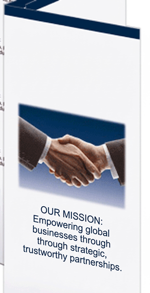
A short introduction or mission statement can also go a long way toward building trust, especially if you’re a newer business or nonprofit. Use this space to clarify the value the reader will get by continuing to flip through your brochure. If they can’t see what’s in it for them within the first few seconds, they won’t keep reading.
How Do You Create a Headline and Cover Visual That Grabs Attention?

Your headline and cover image have mere seconds to convince someone to open your brochure instead of setting it aside. That’s a lot of pressure for a small amount of real estate, so make it count.
Your headline should grab attention and set the tone for everything that follows. Bold, benefit-driven language works best. Rather than “Our Services,” try something like “Get Back to Doing What You Love.” Pair that headline with a high-quality, relevant image or graphic. If you’re promoting a restaurant, show your signature dish in great lighting. If you’re advertising a fitness studio, use real members in action rather than generic stock photography.
Speaking of stock photos: avoid the overused ones. Readers can spot generic, staged images from a mile away, and they create a disconnect between your marketing and your actual business. Aim for something on-brand and unique instead.
What Content Should a Brochure Include to Stay Clear and Concise?
Once you’ve hooked the reader, the body content needs to deliver without dragging them down. Break your information into sections with clear subheadings or bullet points, so readers can scan and find what matters to them.
A few guidelines for this section:
- Use plain language and skip the jargon. Your reader shouldn’t need a dictionary to understand your offer.
- Focus on benefits, not just features. Instead of listing what your product does, explain what it means for the reader.
- Leave enough whitespace. A cramped, text-heavy brochure is harder to read and less inviting to pick up in the first place.
This is where knowing what to put in a brochure really pays off: the goal isn’t to include everything you could say, but to include what your reader actually needs to make a decision.
What Key Details About Your Business or Event Belong in a Brochure?

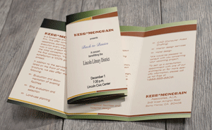
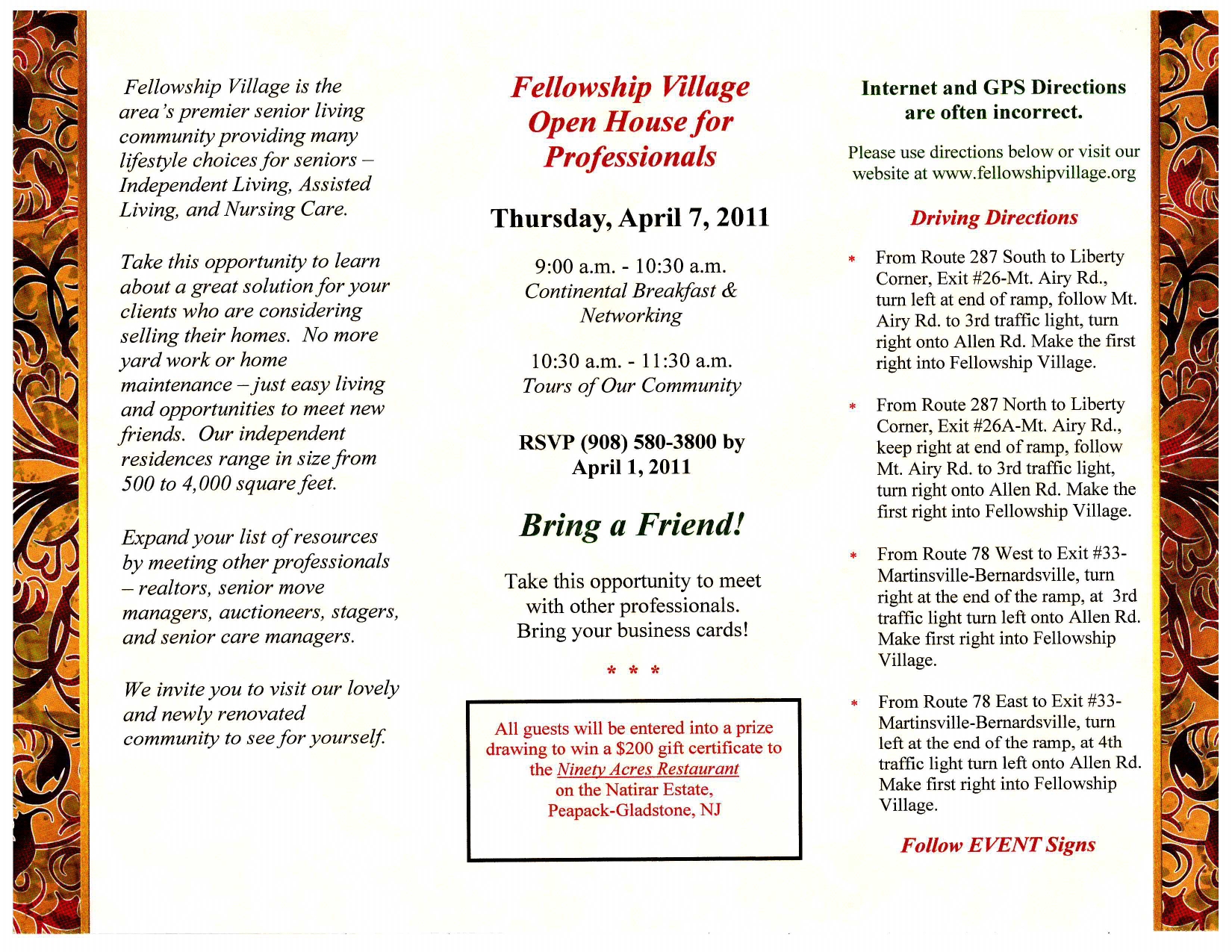
Regardless of your brochure’s purpose, certain details are non-negotiable. Include your business or organization name, what you offer, your mission, and your contact information. If you’re promoting an event, list the date, time, and location, and specify whether it’s in-person, virtual, or both.
Don’t forget to include the year alongside your date. It sounds like a small detail, but leaving it out is a common mistake that creates unnecessary confusion, especially if the brochure gets picked up or reprinted later.
Round out this section with your logo and brand colors. Consistent branding reinforces recognition and signals professionalism, even to readers encountering your business for the first time.
How Do You Add a Call to Action That Actually Gets Results?
A brochure without a call to action (CTA) is a missed opportunity. Tell your audience exactly what to do next, whether that’s visiting your website, calling your office, registering for an event, or making a donation.
Use bold, action-oriented words like “Explore,” “Call Now,” or “Sign Up.” Make your CTA visually distinct with a button, box, or contrasting color so it doesn’t get lost among the rest of your content. If your brochure has multiple panels, repeat the CTA in more than one spot. Readers don’t always start at the beginning, so give them a chance to find your next step no matter where they land.
What Bonus Elements Make a Brochure Even More Effective?
Once you’ve covered the essentials, a few extra touches can push your brochure from good to memorable:
- Testimonials or client quotes build trust by showing real people vouching for your business.
- QR codes link directly to your website or a signup page, bridging the gap between print and digital.
- Quick stats or facts demonstrate your impact or value at a glance.
- Social proof, like logos of clients, partners, or awards, adds credibility without extra text.
On the design side, match your brand’s visual style and tone throughout. Stick to consistent fonts and a clean layout, and balance visuals with text so no single panel feels cluttered or empty.
Turn Your Next Brochure Into a Marketing Asset
A well-designed brochure does more than inform. It converts. Whether you’re showcasing your business, an event, or a new product, the right mix of visuals, content, and calls to action makes your message memorable long after the brochure leaves someone’s hands. Use this guide as your checklist for what should be included in a brochure, and build your next one with intention, clarity, and impact.
Ready to design a brochure that stands out? Browse brochure templates and printing options at PaperDirect.com to turn your message into a marketing masterpiece.
Frequently Asked Questions
What should a brochure include at a minimum?
At minimum, a brochure should include a clear purpose, a strong headline and cover image, concise content in digestible sections, key contact or event details, and a visible call to action.
What things should you put on a brochure for an event?
For event brochures, include the full date (with year), start and end time, location, and whether the event is in-person, virtual, or hybrid. Registration details and deadlines are also worth including if applicable.
How long should the content sections of a brochure be?
Keep each section short and scannable. Use bullet points and subheadings rather than long paragraphs, since readers typically skim a brochure before deciding to read closely.
Do I need a call to action if my brochure is just for brand awareness?
Yes. Even an awareness-focused brochure benefits from directing readers to a website, social media page, or contact method so they can learn more after they’ve engaged with your content.
What’s a common mistake to avoid when designing a brochure?
Using generic stock photography is one of the most common mistakes. It creates a disconnect between your brochure and your actual business, so opt for original, on-brand imagery instead.