
Recognizing students and staff is essential for building a positive and productive school environment. When people feel seen and appreciated,
Continue reading
PaperDirect’s marketing tips will give you insights to promote your business needs to round out a unique marketing mix for the “four Ps”: price, place, promotion and product. Following our marketing tips will help you to avoid some of the pitfalls many companies fall into. Some key areas where you should implement your marketing message are:
* Sales Message & Promotion – through flyers and trade shows
* Advertising & Direct Marketing via banners and door hangers
* Packaging & Merchandising with great displays ideas to convey marketing messages
Recognizing students and staff is essential for building a positive and productive school environment. When people feel seen and appreciated,
Continue reading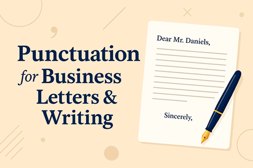
Punctuation is a vital tool for clarity, professionalism, and creating the right impression. In the corporate environment, poorly punctuated correspondence
Continue reading
Business brochures continue to thrive as powerful marketing tools that can capture attention, build credibility, and drive action. In a
Continue reading
It’s not too much of a stretch to suggest that the age-old tradition of sending greeting cards to your friends,
Continue reading
Spread the holiday cheer with a beautiful holiday greeting card! Choose amongclassic, deluxe, elite, and premium holiday cards that you
Continue reading
The summer is great for bringing people together and having fun. The longer days and hot weekends come with pool
Continue reading
Honor the employees that have gone above and beyond on the work that they have done. There are many ways
Continue reading
The next big party after Prom is the Senior All-Night Party! You’ll need many items to have an amazing party
Continue readingShopping on Black Friday has become as big a tradition as the feast the day before. As the top deal day
Continue reading
You’ve received some training, you’ve sent out your resume, and now — at long last — you’re finally headed toward
Continue reading
Business cards are often the first currency of a business transaction. You meet someone, decide to stay in touch, and
Continue reading
Every business knows that in the weeks before Mother’s Day and Father’s Day, kids across the country race to local
Continue reading
With all the various forms of online communication at our fingertips, it can be very tempting for a manager to
Continue reading
Who are digital natives? They’re the incoming workforce who’ve been submerged in digital technology since the day they were born.
Continue reading
Even if your facts and figures are right on the money, you’ll still lose points with your fellow employees and
Continue reading
So you’ve created an awesome online course that can help dozens, hundreds or even thousands of people–if only they’d
Continue reading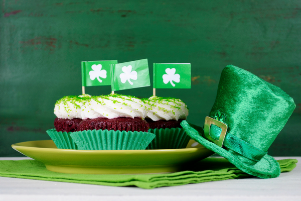
Everyone knows that St. Patrick’s Day can be loads of fun with friends and family getting together for parades, corned
Continue reading
Seriously, where did 2016 go? It seems like the year just began but actually, 2017 is rapidly approaching and the
Continue reading
Targeting a local audience with your Small Business Saturday promotion ideas can definitely happen in person and in your shop.
Continue reading